Rebrand and website redesign for PNW nonprofit
Full Rebrand
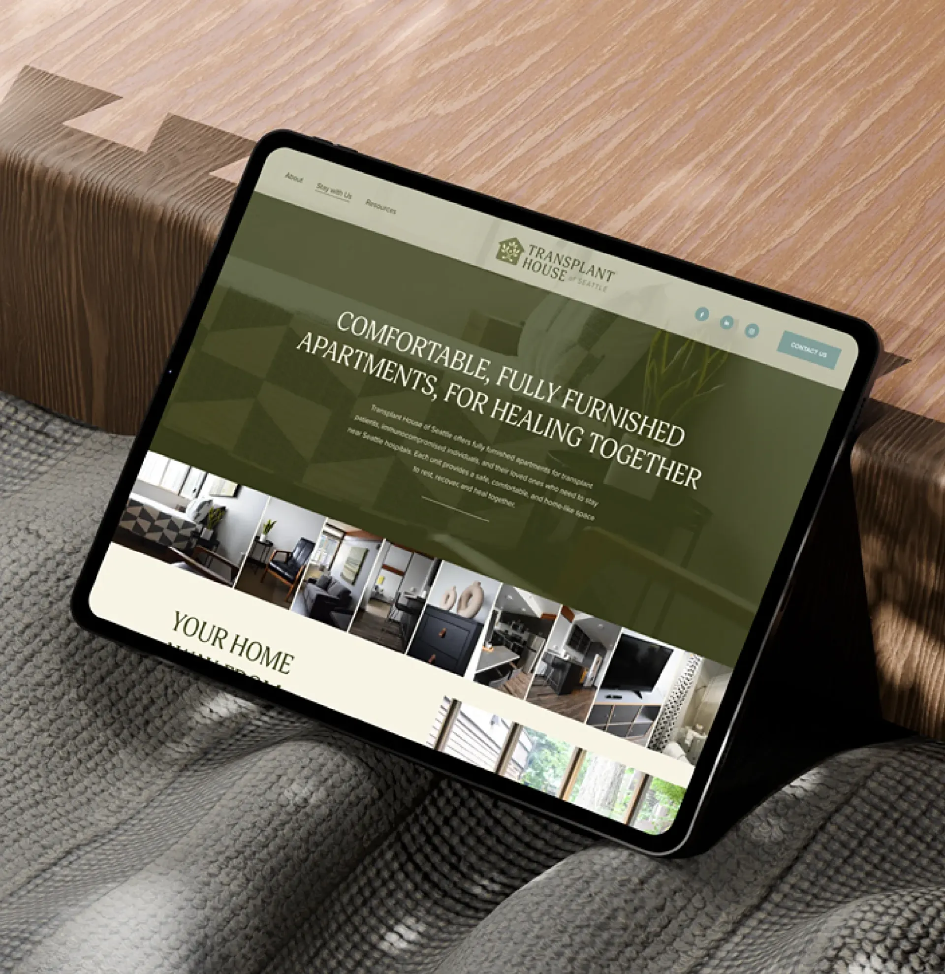
New Website
Visual Identity
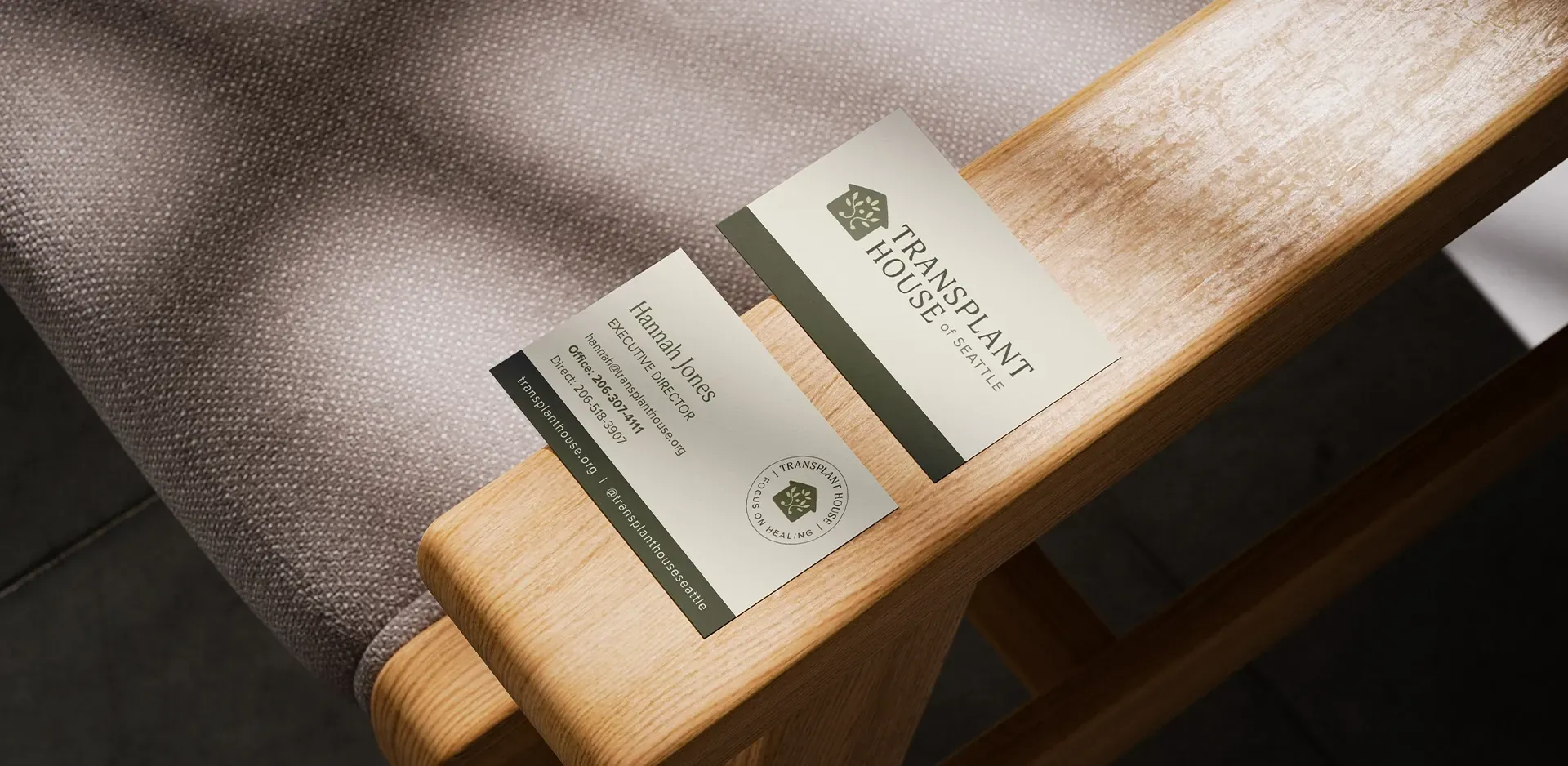
Extra Brand Assets
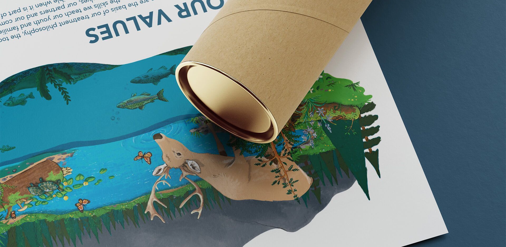
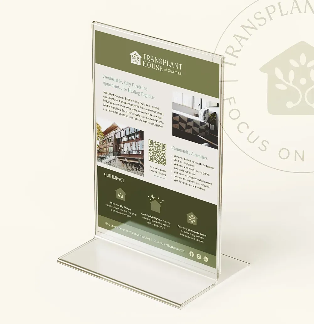
Print Design
overview
Impactful redesign and refresh for an organization providing housing for people who need life-saving medical care in Seattle.
In collaboration with Lauren Lester
Transplant House provides vital housing for families traveling to Seattle for life-saving treatment. With an outdated site, limited brand assets, and an inconsistent visual identity, they knew it was time to pull in the experts to bring their brand back to life.
Knowing this was going to be a big
nonprofit web design build, I pulled in Lauren to lead the web and systems part of the project, so I could focus on reviving their brand identity and creating a refreshed logo suite. Our combined skillset helped this nonprofit restore the life of their brand and website, so they could start attracting new donors and community partners without calling in favors.
Objectives
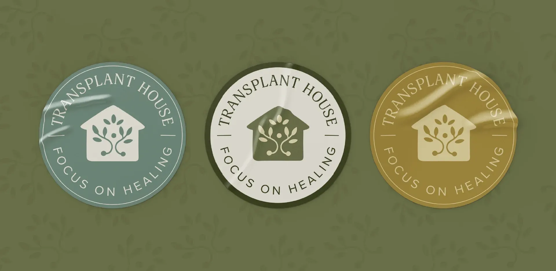
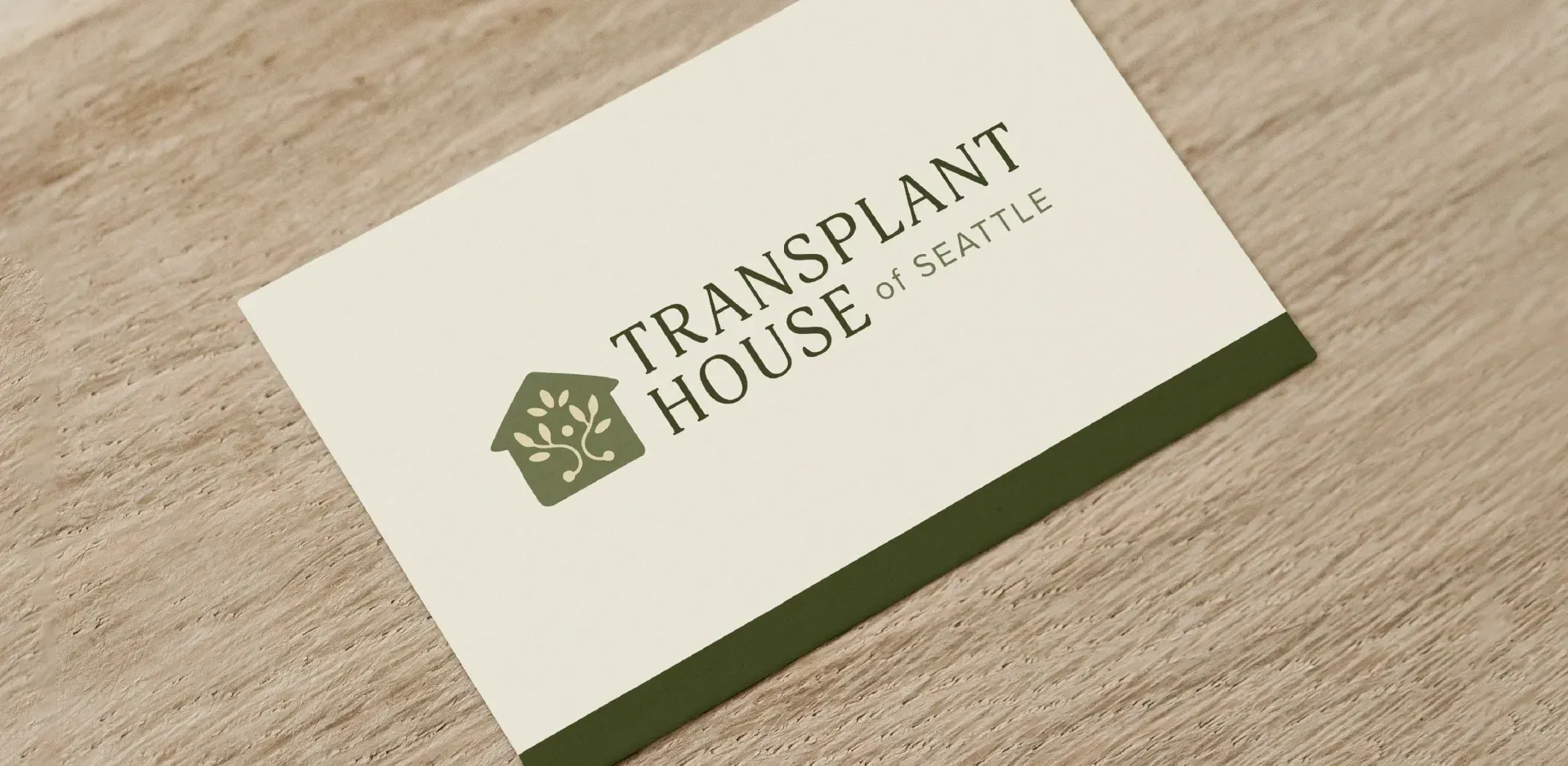
- Create a logo that represents the core essence of the brand.
- Develop the primary logo into a logo family that can be effectively used across a variety of marketing and promotional content.
- A warmer, more human-centered brand presence, with design that reflects the heart of their mission, attracting donors and guests alike.
- Elevate the brand with a refreshed identity that allows you to connect with intention, making a good first impression right from the start.
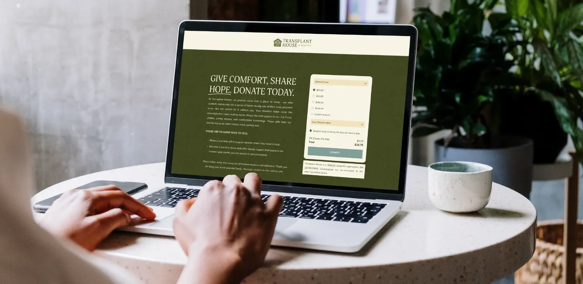
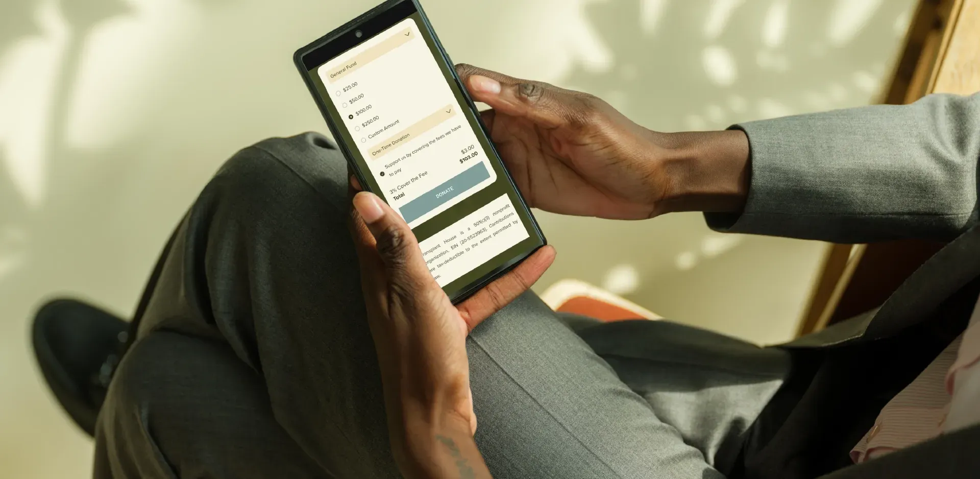
- Stronger donor engagement through more prominent calls-to-action and easier giving options (both one-time and recurring).
- Build on a flexible platform that allows your team to manage content updates in-house, like adding client stories, updating events, or updating staff bios.
- Increase engagement and traffic by creating a warmer visual identity and website infused with as much care as they provide their guests.
strategy & design
From drab and dreary to warm and cheery.
We begin every rebrand with a call to ask questions that get to the heart of who you are as a brand. Also clearly identifying what needs to stay and what aspects of your brand could use some extra dusting. Ensuring that every creative decision aligns with your core mission.
From there, we move into market research and strategy work to determine a visual direction that has the potential to represent everything you stand for. In this case, we reviewed visual inspiration from the client and took a look at local nonprofits to ensure our proposed concepts would stand out in the local market. We knew from the start, we'd be ditching the black and grays to create a brand that was more inviting.
Mood boards and initial concepts were presented together to our client partners before being shared with their board for final approval. We nailed the visual direction as we secured board approval on round one.
DEVELOPMENT
Rebrand rooted in the warm and welcoming spirit of the Pacific Northwest.
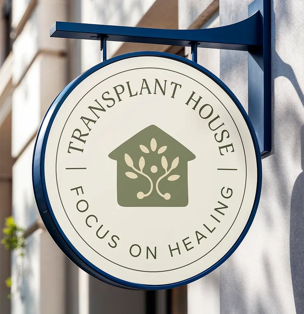
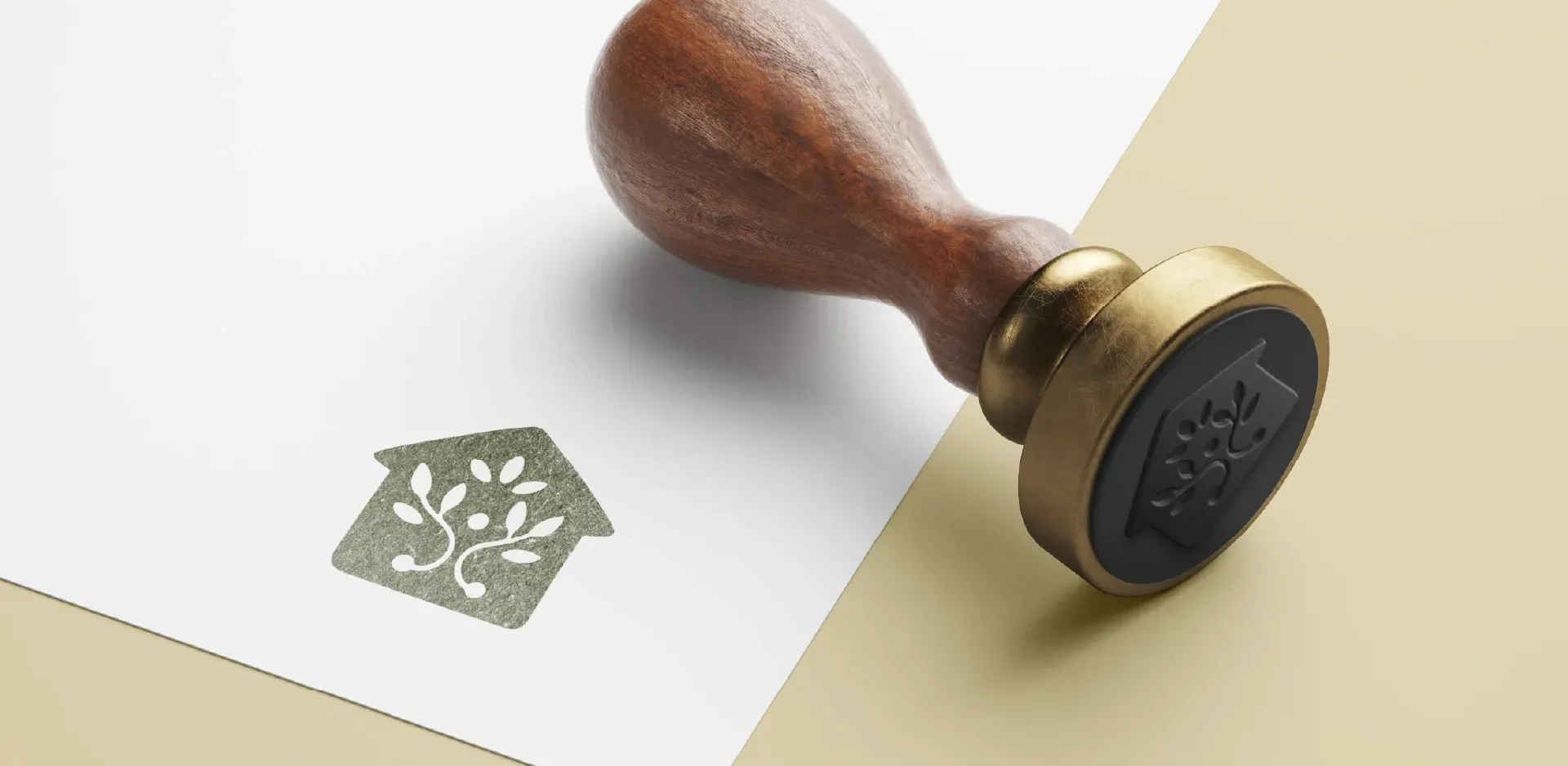
Healing away from home isn't an easy task and the staff helps to create a space that is both soft and secure. Because of their commitment to providing safe and comforting housing that feels like home, their logo intertwines with the idea of community support and safety.
The growth from the bottom circles represent the life provided by transplant donors, while the leaves are a symbol of everyone involved in the healing journey. Found within the center is another circle to portray the patient and the surrounding house to provide a safe space to heal.
Inspired by the colors of the PNW, their refreshed color palette is warm and earthy to create a sense of hope.
Once the visual identity was dialed in, Lauren jumped in to lead the development of their refreshed nonprofit website.
the impact
“Everything has been so thoughtfully curated, I am so proud of all of the work you have done to help revamp our brand, THANK YOU!!”
Hannah Jones
Executive Director of Transplant House
This PNW organization started with an inconsistent brand across print and digital spaces. Together, we improved brand recognition by creating a united visual identity that builds trust with community partners, donors, and guests alike. Only a few short months from launch, they've already seen a significant increase in donations.
With a website that communicates clearly alongside, staff directs patients and community partners there with full confidence knowing that answers can be found.
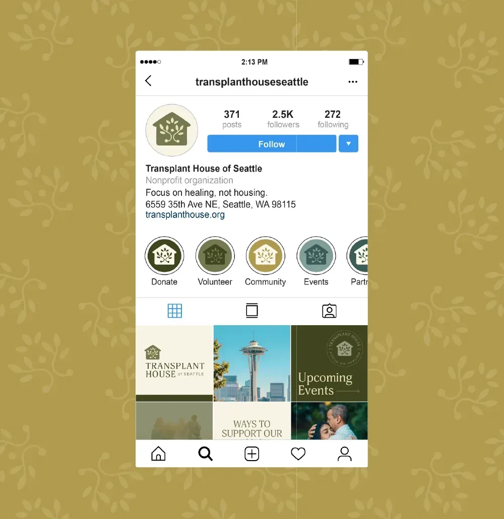
Since their rebrand and website launch, Lauren and I have continued our partnership with this mission-driven organization. Utilizing their refreshed visual identity to transform their social media profiles, monthly newsletters, and print design materials.
Visit the
Transplant House website to check out all the pages or find ways to support their mission.
Let's prepare your brand for sustainable growth.
Fill out my inquiry form to take a step towards the brand transformation of your dreams. I look forward to hearing about your purpose-driven business and inspiring pursuits.
Continue exploring my work